Celebrating
Courage
Guidelines
Welcome to the Celebrating Courage Visual Identity Manual! This document has been carefully prepared to guide and preserve the integrity of our brand in all its manifestations. With the aim of ensuring consistency and cohesion at all points of contact with the public, this manual is an essential tool for all employees and partners who work with our brand.
As a digital resource, this manual offers the convenience of instant access and real-time updates, making it easy to use on a day-to-day basis. With an organized structure and easy navigation, it is a centralized source of information that helps ensure the correct application of visual elements, from packaging design to online presence, thus strengthening Celebrating's identity and recognition in the market.
Visual expression
01.0
02.0
03.0
04.0
05.0
06.0
07.0
08.0
09.0
10.0
Logo
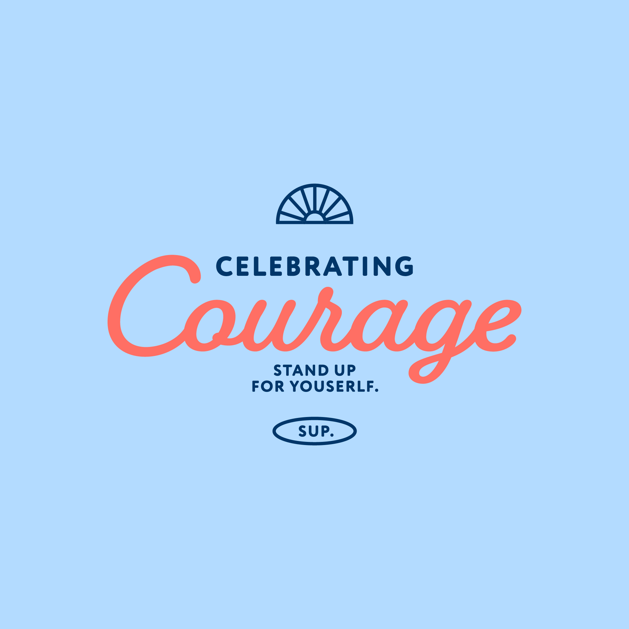
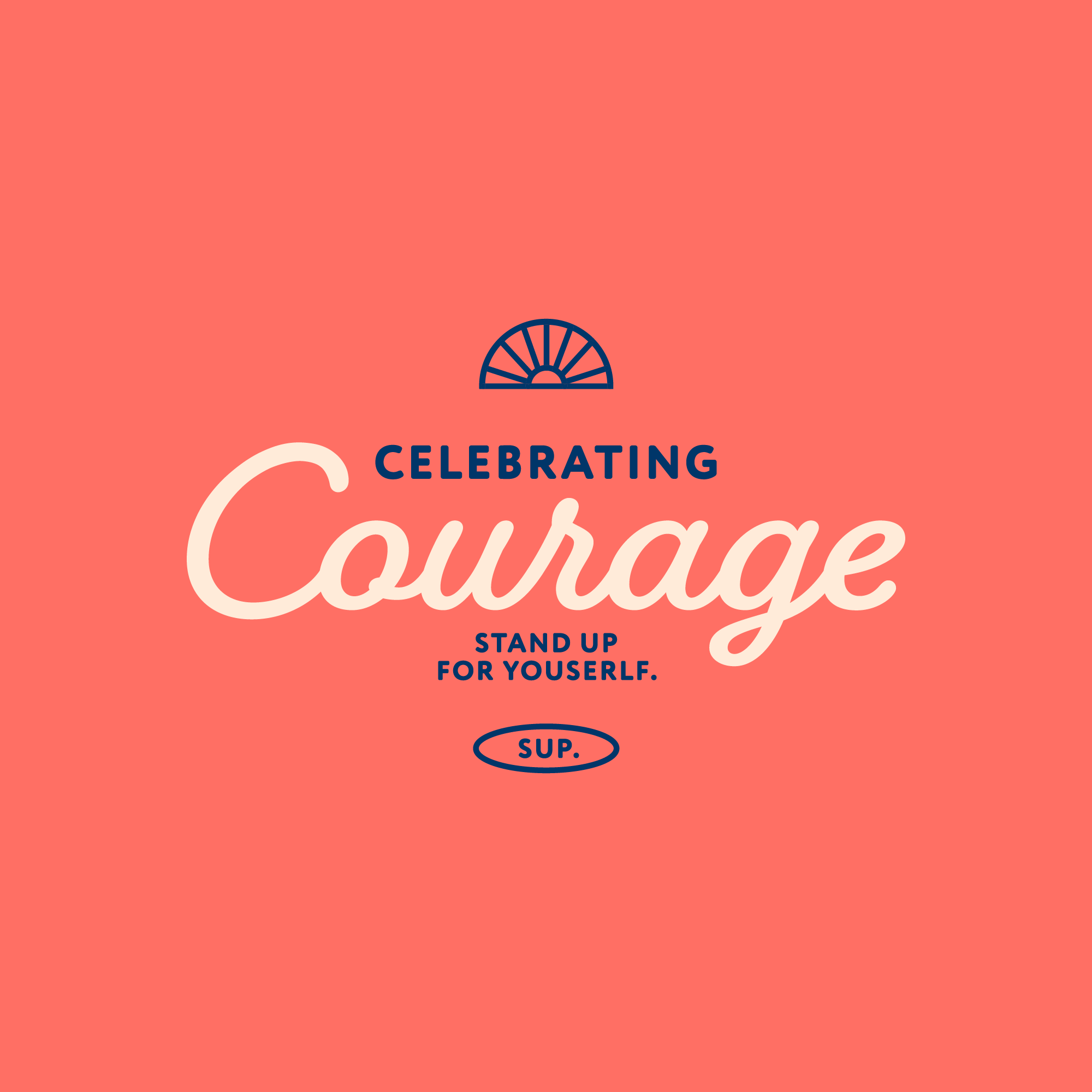
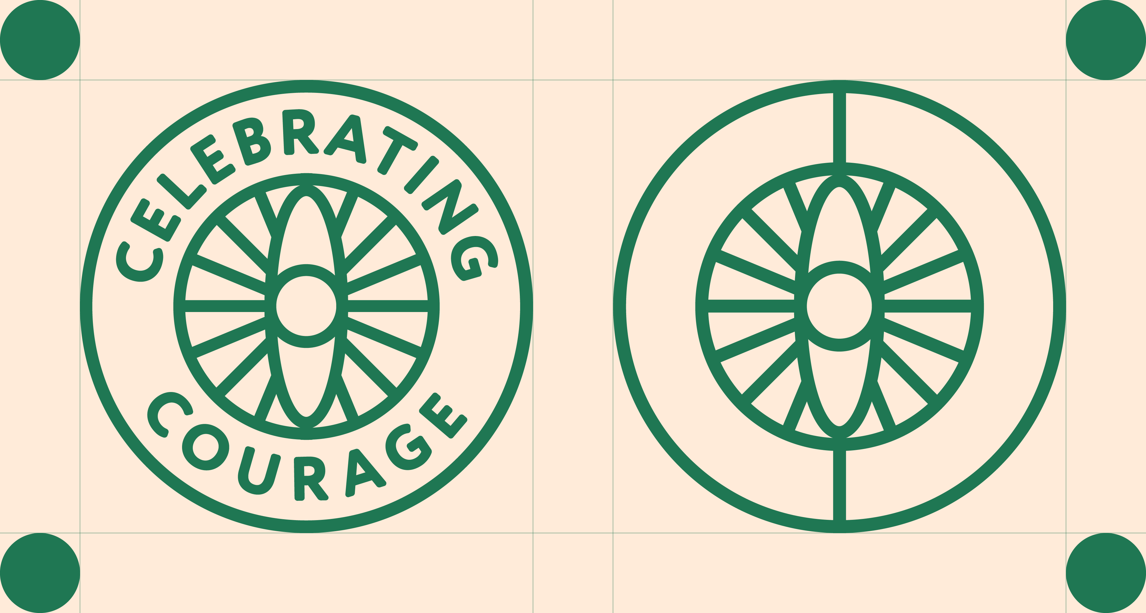
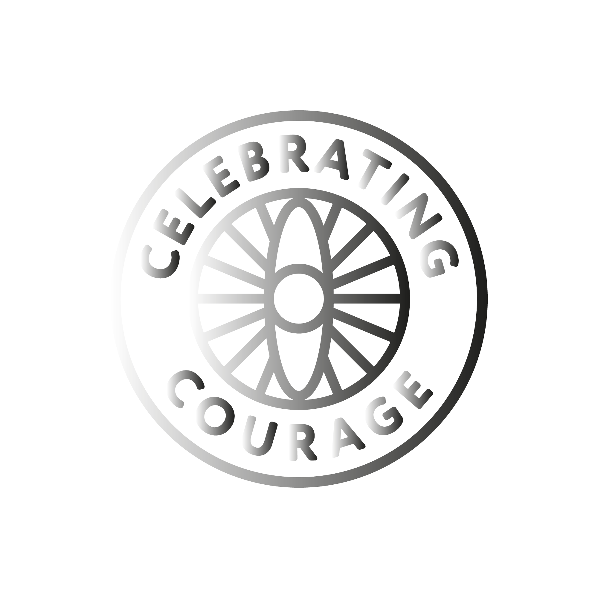
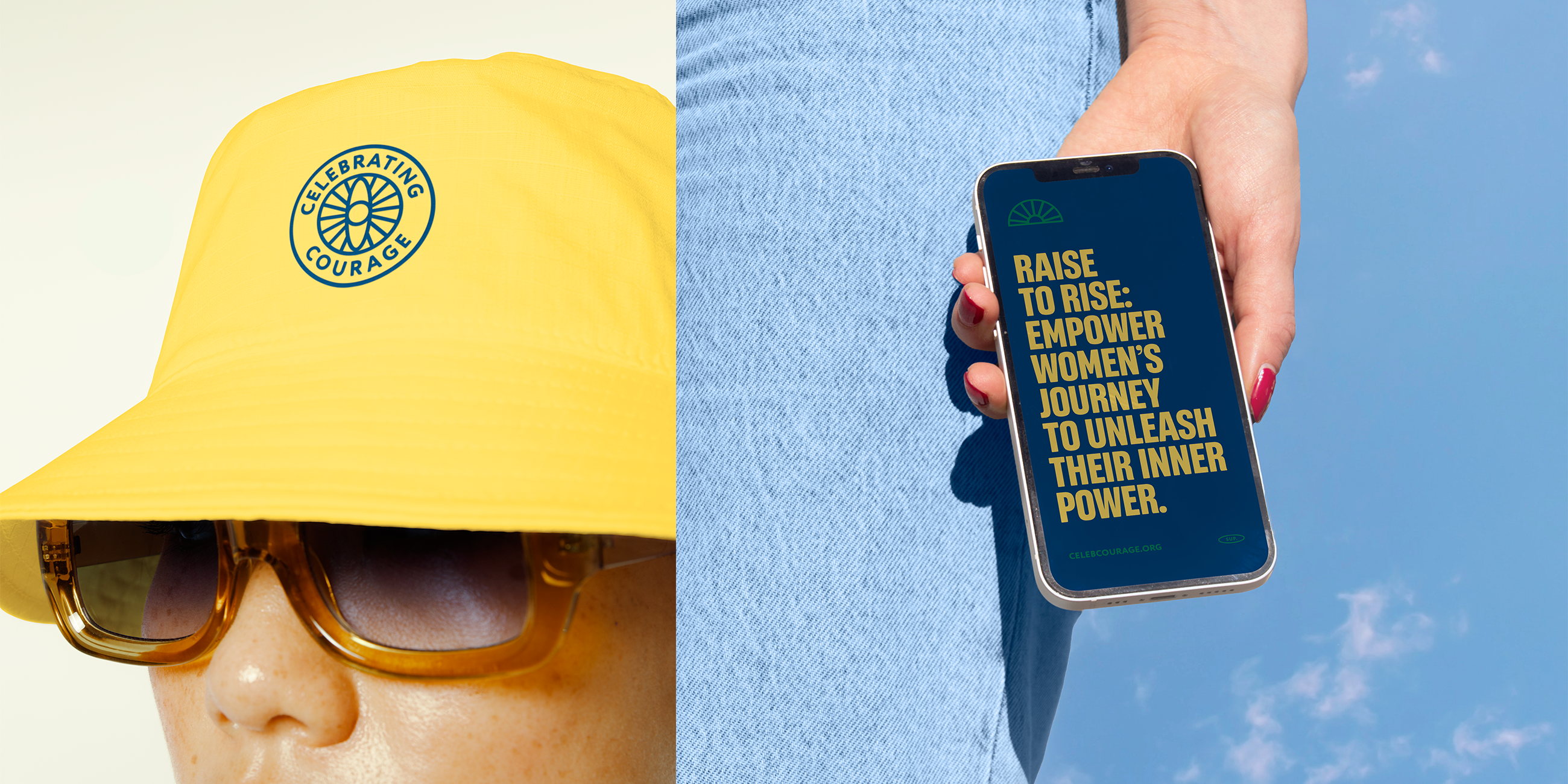
Celebrating Courage's differentials relies on its origin, helping women overcome their fears through paddle boarding. The logo is formed by the combination of a paddle with the sun, promoting the idea of courage and personal expansion. The simplified typography is approachable, making the emblem friendly and straightforward.
Remember to never:
→ change the color of the logo;
→ scale or distort;
→ use effects (drop shadow, etc.)
Logo Kit
→ The Celebrating logos can be downloaded here:
Symbol
The presence of a symbol is fundamental for a brand, as it provides a distinctive visual representation that can be easily recognized and remembered by the target audience, thus strengthening the identity and emotional connection with the brand.
→ Celebrating Courage symbol can be downloaded here:


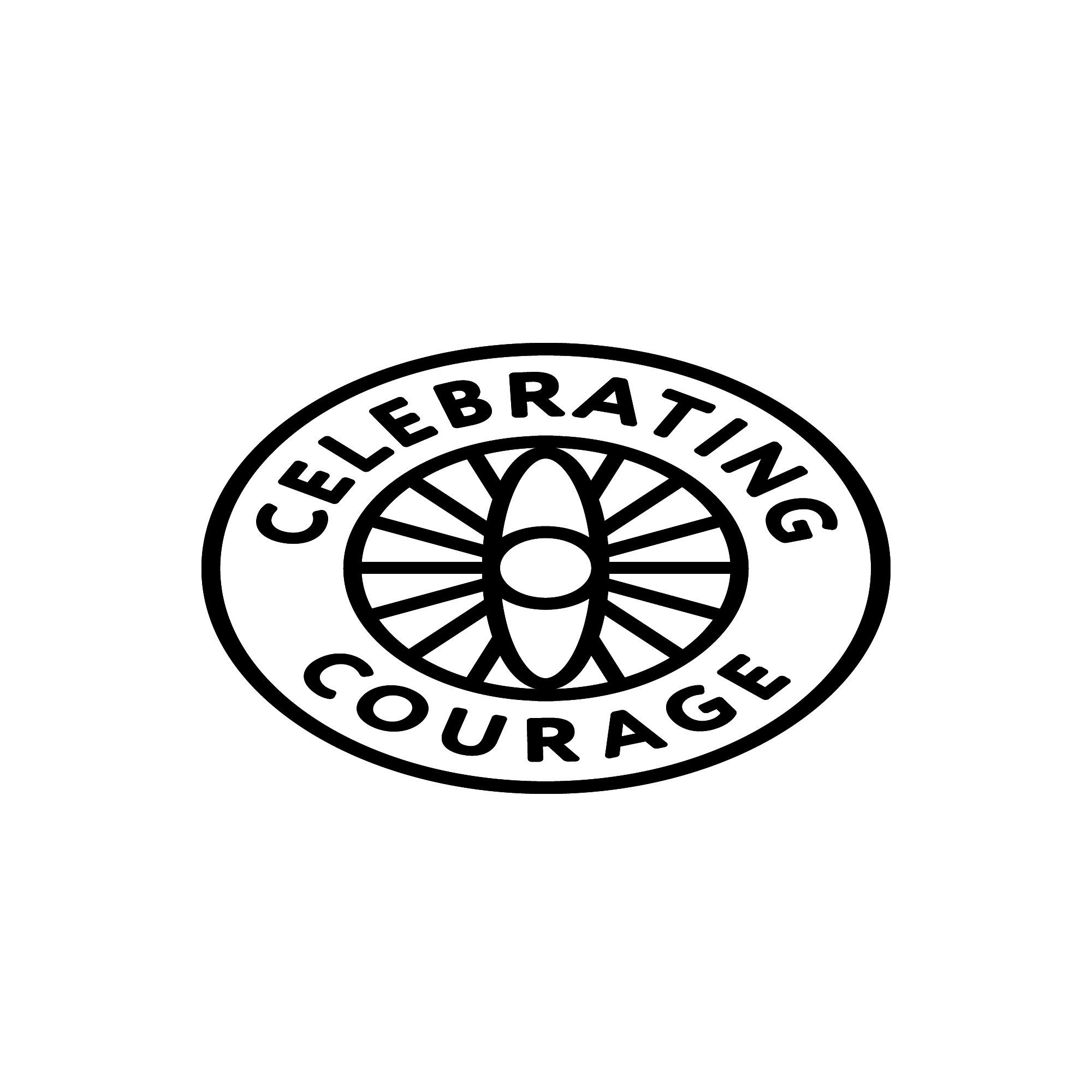
Alternative
Logo
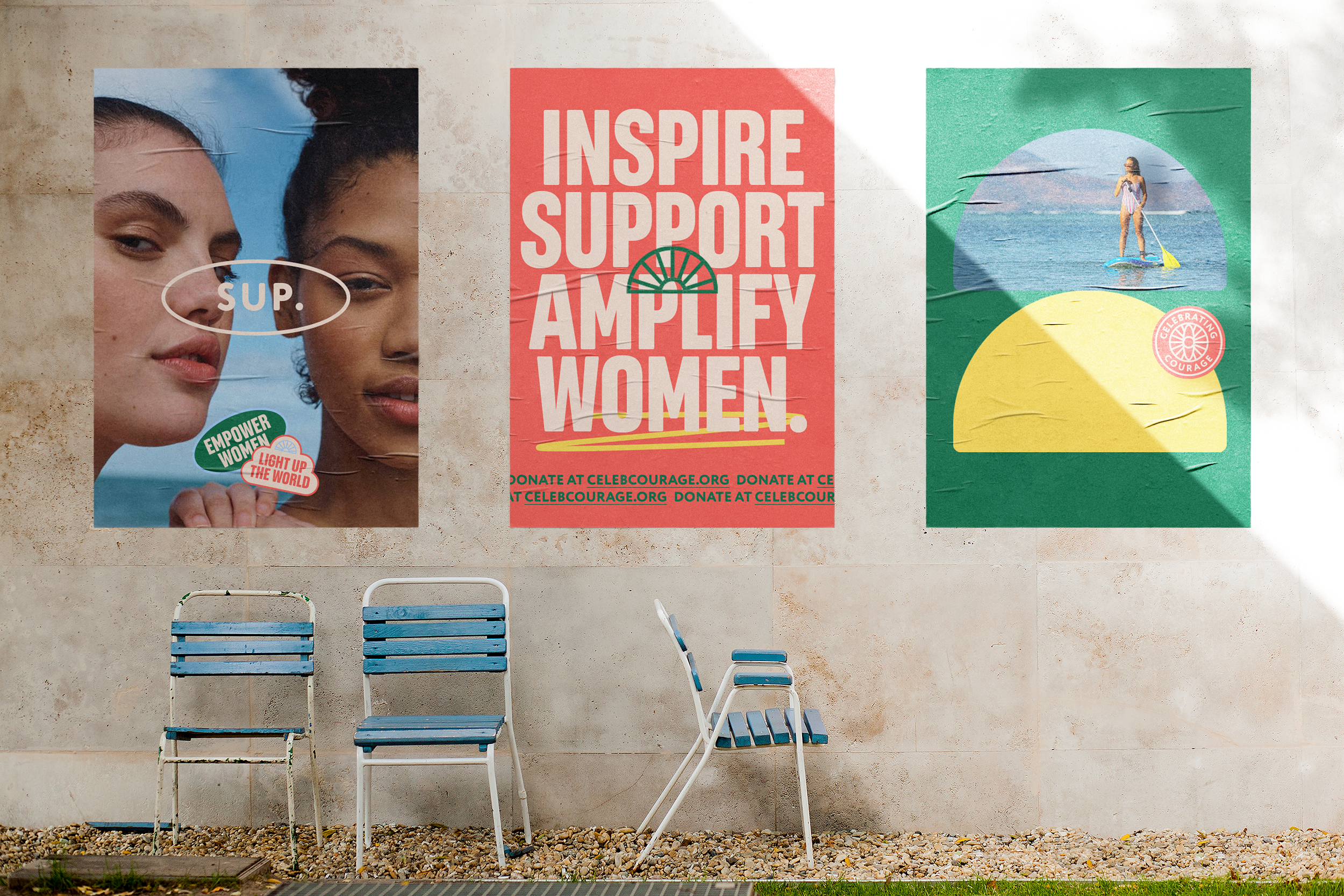
To strengthen the Celebrating brand, the alternate logo reinforces brand elements subtly and with a vintage flair, capturing the audience's attention. This version can be used in promotional materials for the campaign, such as t-shirts, tote bags, and posters.
→ The alternative logo of Celebrating can be downloaded here:
Reduction
The reduction establishes the minimum limits for the application of brands and symbols in both digital and printed media. Never exceed these minimum limits to ensure that the brand is clearly read.
Digital
Min Width : 50px
Min Width: 2,5cm

Digital
Min Width : 30px
Min Width: 1cm
Clear Space
Clear space refers to the area around the logo that must be kept free of any visual elements or text. This space is fundamental to ensuring the clarity, legibility and impact of the logo. Encroaching on the clear space can compromise the visual integrity of the brand and make it difficult to identify and recognize. Therefore, respecting the clear space is essential to preserve the integrity and effectiveness of the logo in various applications and communication contexts.
Positive &
Negative
The positive logo is the standard version, where the brand symbol or text is displayed in its original color on a neutral or contrasting background. This version is commonly used in situations where legibility and visibility are priorities.
On the other hand, the negative logo is the inverted version of the positive logo. In this variation, the colors are inverted, resulting in the brand symbol or text in a light color on a dark background. The negative logo is used in situations where the background is dark or colored, ensuring that the brand remains visible and recognizable.
Positive
Negative
Positive

Negative
Color Palette
A color palette, also known as a color scheme, is a selected set of colors that a brand uses consistently in its visual identity. Carefully choosing the color palette is extremely important for a brand, as colors play a crucial role in communicating messages, creating emotional associations and differentiating in the marketplace.
The color palette is inspired by the sport, with dark green and light blue, but also incorporates shades of pink and yellow to inspire energy and positivity.
A diverse and colorful palette allows for both safe
and bold combinations, adapting to the audience
it aims to reach.
Remember not to:
→ use combinations that do not promote contrast;
→ create your own colors;
→ change color values/codes.
HEX #1f7753
RGB 31, 119, 83
CMYK 84, 29, 75, 16
PANTONE 7726 C
HEX #b3dbff
RGB 179, 219, 255
CMYK 33, 5, 0, 0
PANTONE 291 C
HEX #ffebd9
RGB 255, 235, 217
CMYK 0, 11, 16, 0
PANTONE 9224 PASTEL
HEX #ff6f64
RGB 255, 111, 100
CMYK 0, 69, 53, 0
PANTONE 2345 C
HEX #ffdf63
RGB 255, 223, 99
CMYK 2, 11, 70, 0
PANTONE 120 C
HEX #003669
RGB 0, 54, 105
CMYK 100, 82, 34, 20
PANTONE 2955 C
Main Typography
Typography plays a crucial role in defining a brand's visual identity. It is a powerful tool for communicating a brand's personality, style and values, while contributing to consistency, legibility and differentiation in the marketplace.
The main typography of the brand combines the qualities of being condensed and impactful with rounded edges, creating a unique blend of strength and approachability. This choice conveys ideas with a strong presence while maintaining a friendly tone. When paired with the color palette, it creates a fun and cohesive brand identity that aligns perfectly with the campaign universe.
MAIN FONT
Realce
Designed by Alexander Lubovenko, Alexandra Korolkova and Maria Kharlamova, from Paratype Find here
AaBbCcDdEeFfGgHhIiJjKkLlMmNnOoPpQqRrSsTtUuVvWwXxYyZz
0123456789&%€
Secondary
Typography
Typography plays a crucial role in defining a brand's visual identity. It is a powerful tool for communicating a brand's personality, style and values, while contributing to consistency, legibility and differentiation in the marketplace.
The secondary typography of the brand is a sans-serif font with rounded edges, contrasting with the impactful presence of the main typography. It conveys confidence and closeness in a subtle manner.
SECONDARY FONT
Circe Rounded
Designed by Carlos Mignot, from Plau Studio Find here
AaBbCcDdEeFfGgHhIiJjKkLlMmNnOoPpQqRrSsTtUuVvWwXxYyZz
0123456789&%€
Misuses
Misuse of the logo can seriously compromise the integrity and image of the brand. When the logo is applied inappropriately, such as in situations where its scale, proportion or colors are altered, or when it is placed in inappropriate contexts, this can result in a distorted and confusing representation of the brand.
Do not apply effects.
Do not use the logo in outlines.
Do not use colors outside the palette.
Do not use gradients.
Do not change the proportions of the brand.
Don't invade the brand's reserved space.
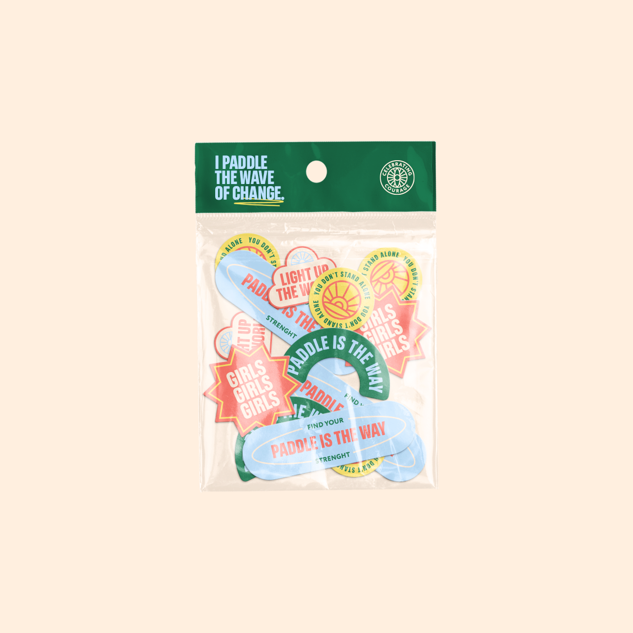
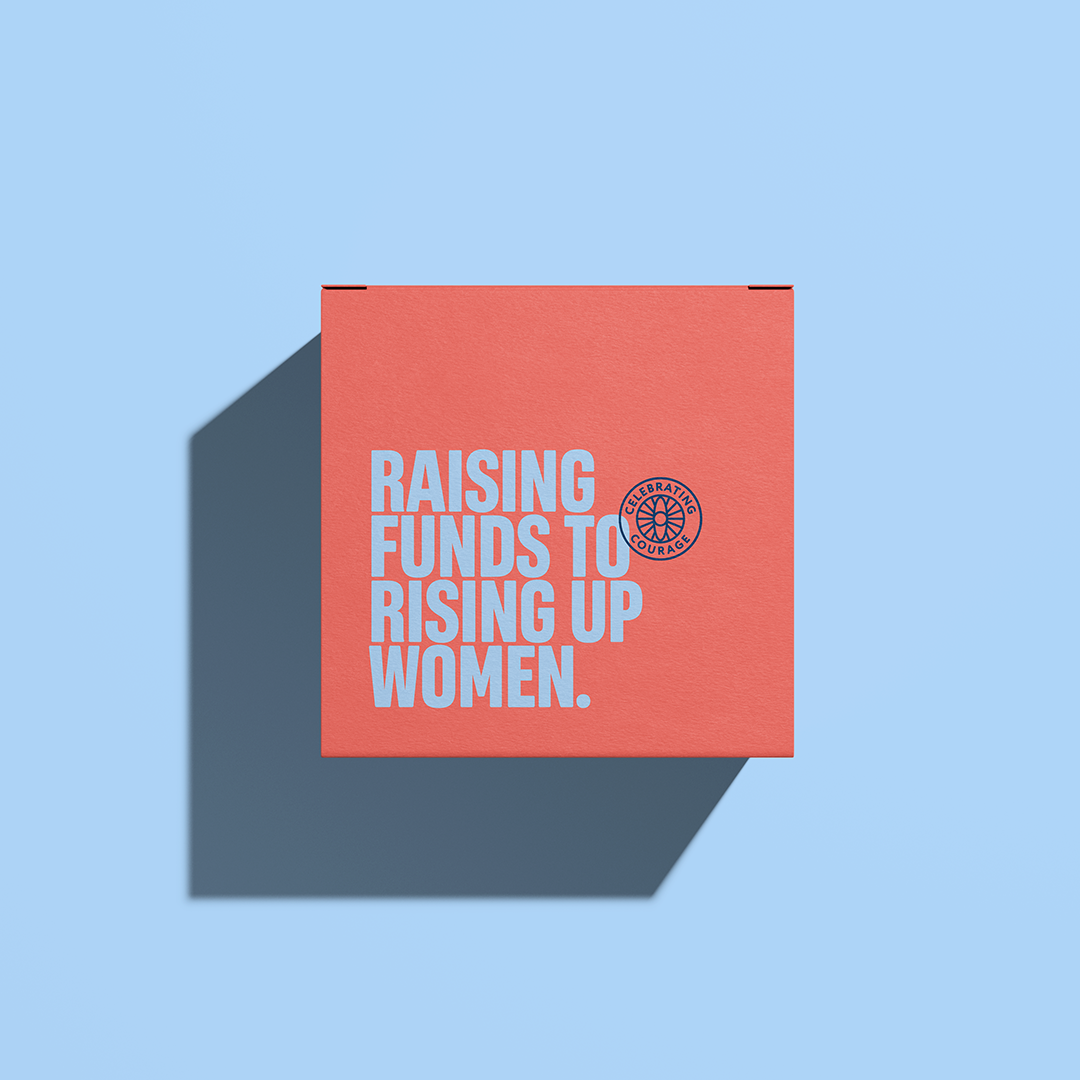
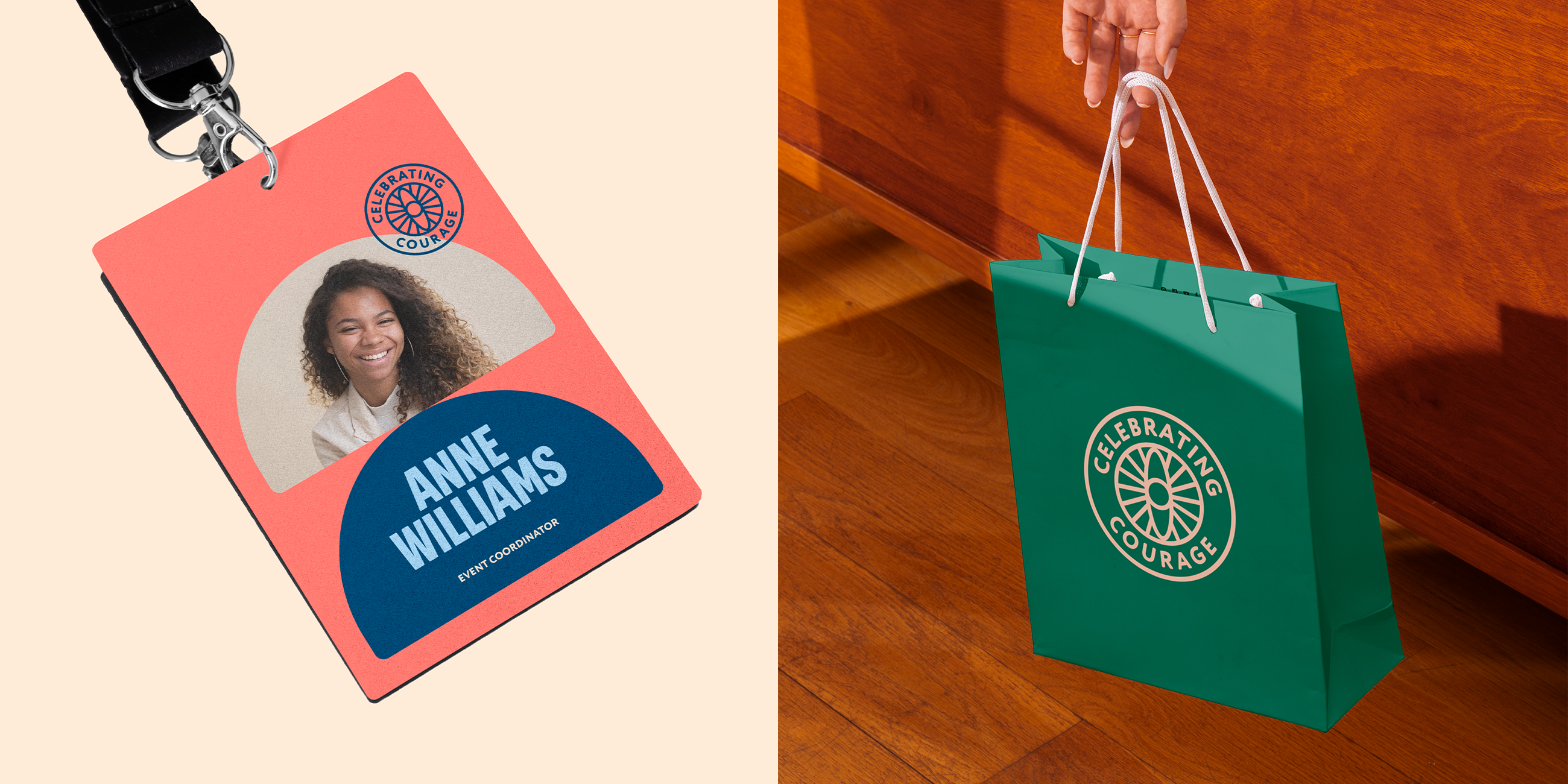
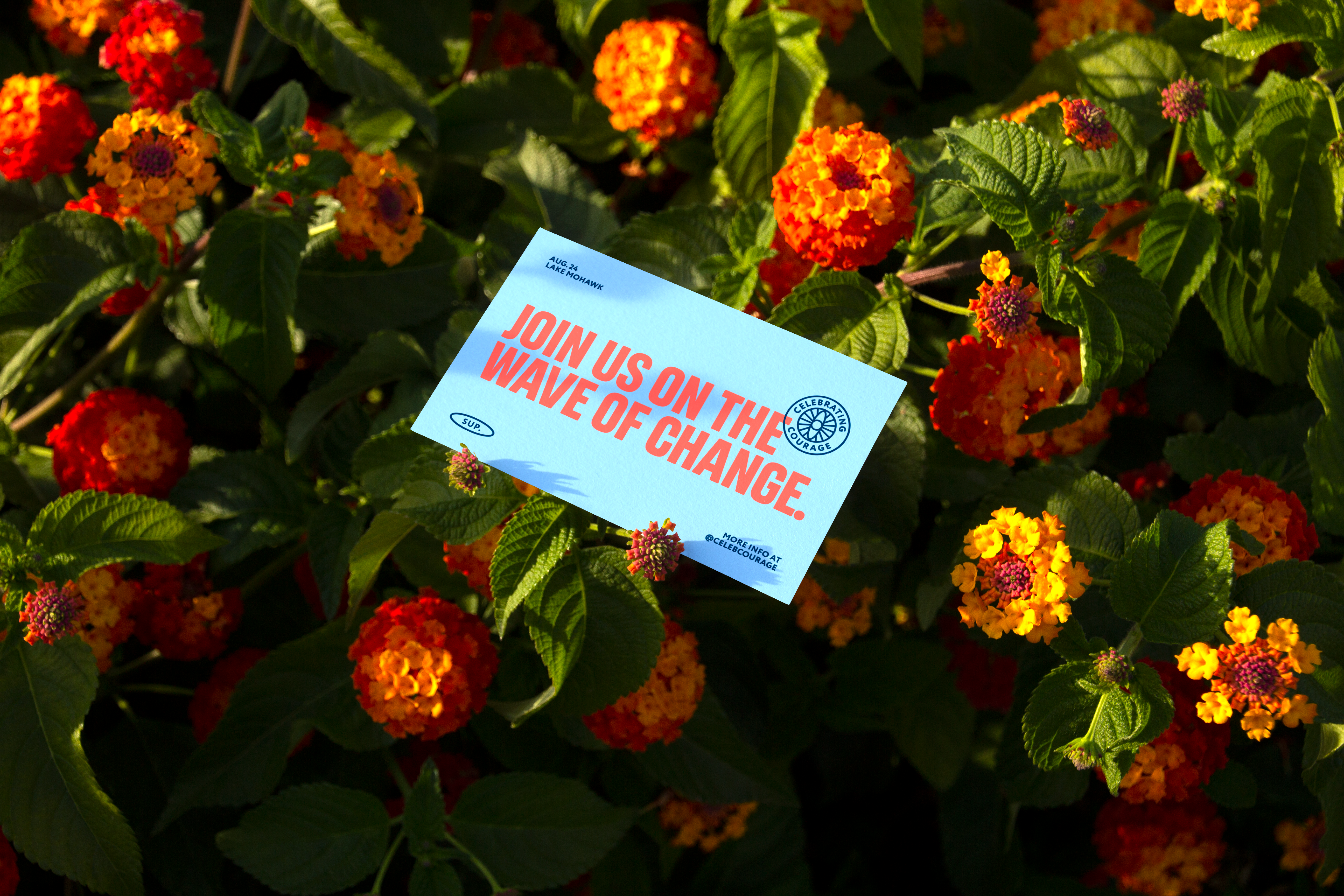
Assets
Visual assets play a crucial role in building and maintaining a brand's visual identity. They include elements such as the logo, colors, typography, images and icons that are consistently used in all brand materials. Defending them means recognizing their importance in creating a strong and memorable visual presence for the brand.
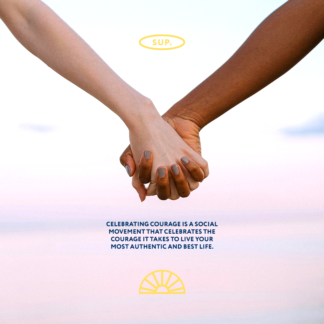
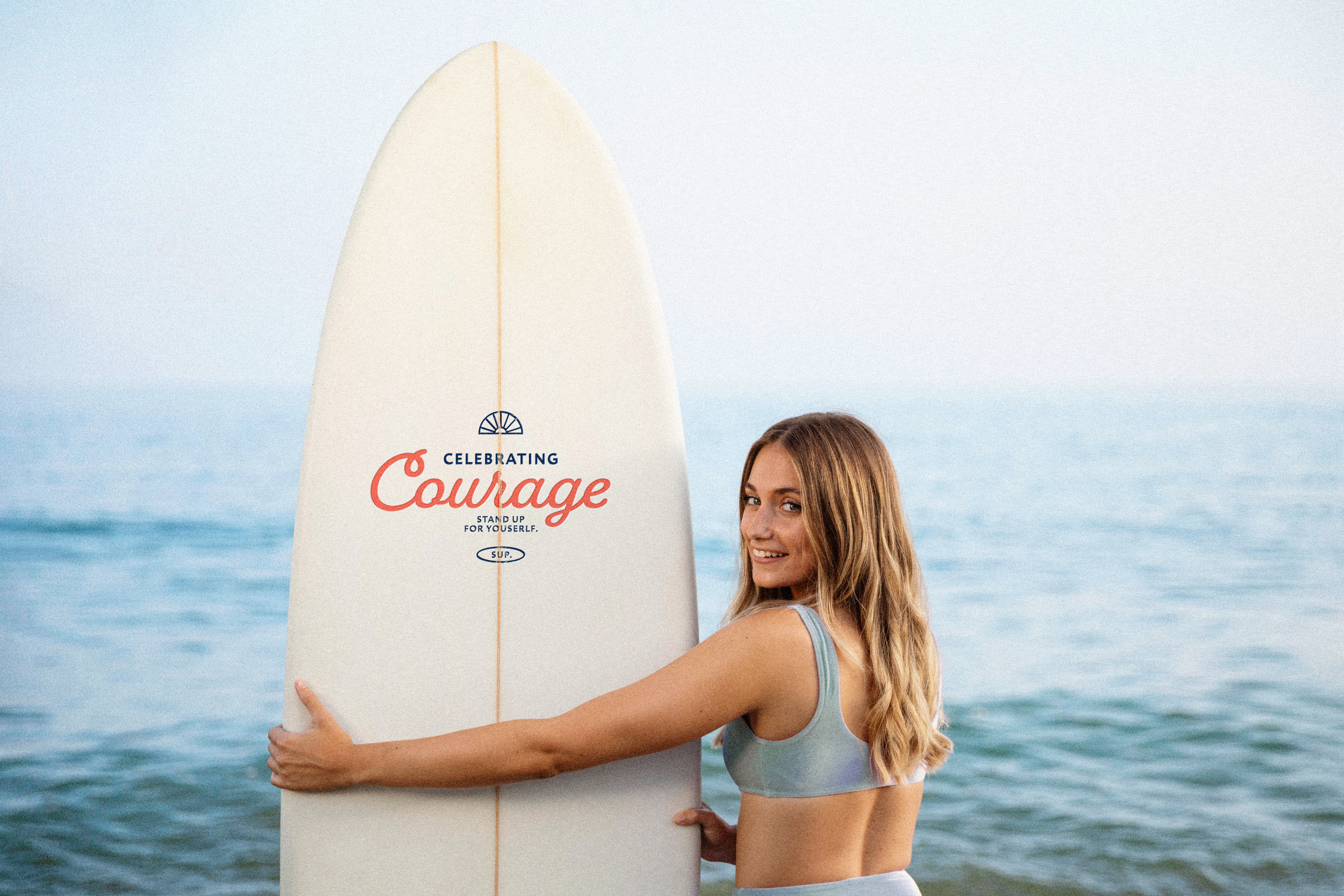
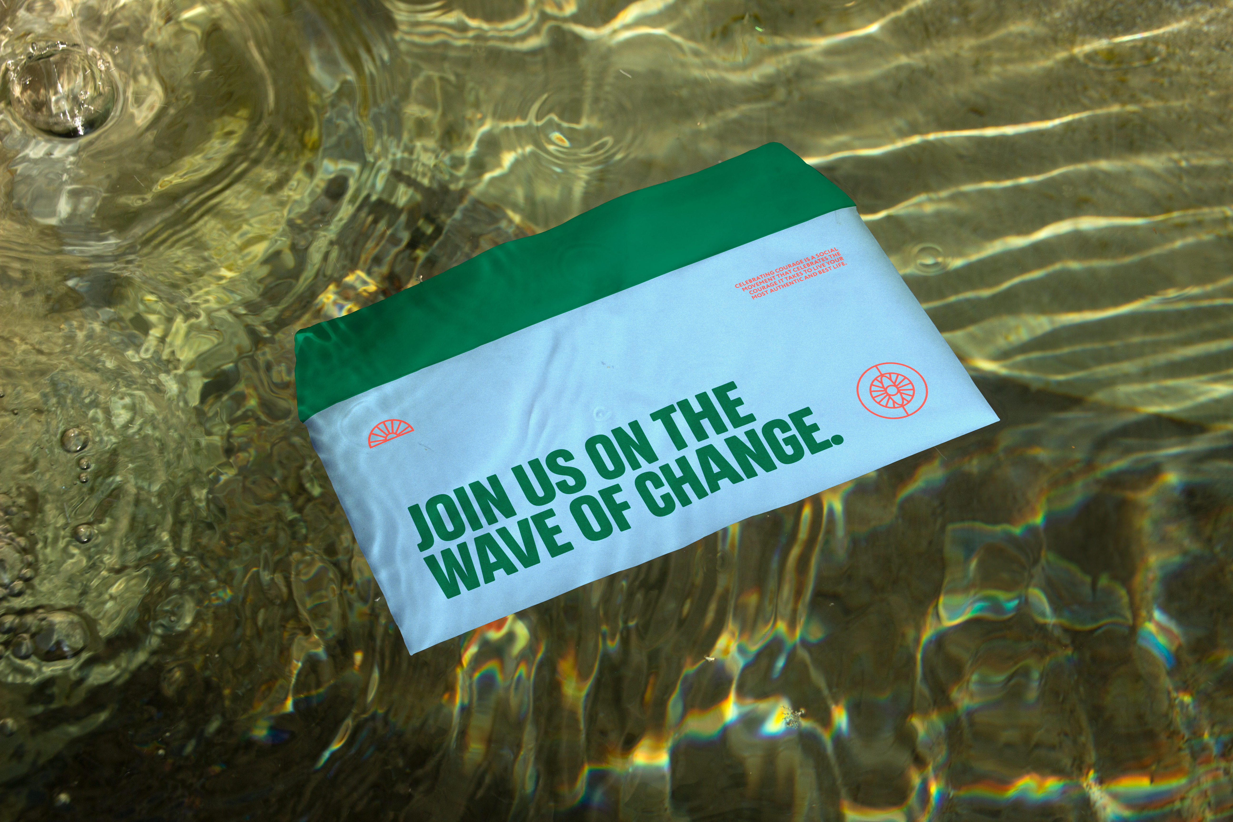
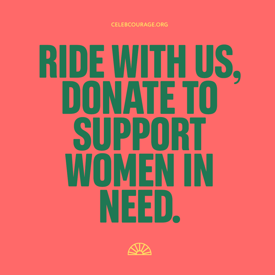
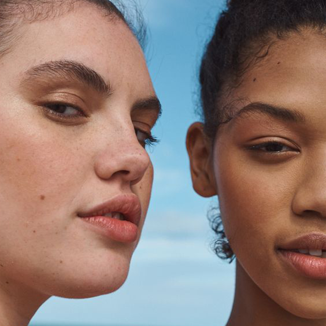
Photographs with the same style make it easier to communicate with the target audience. In this sense, we followed some guidelines for the Celebrating audience, in order to unify the way we reach people. The images capture the strength and determination of the women involved, through the paddle. The images should be carefully selected to emphasize the diversity and unity of women, celebrating their achievements and reinforcing the message of overcoming.
→ To access the Celebrating assets & Instagram feed, click here:


INSTAGRAM LOOK & FEEL
There's always time for a cup of coffee
CELEBRATING COURAGE
Overcome your fears.
celebcourage.org